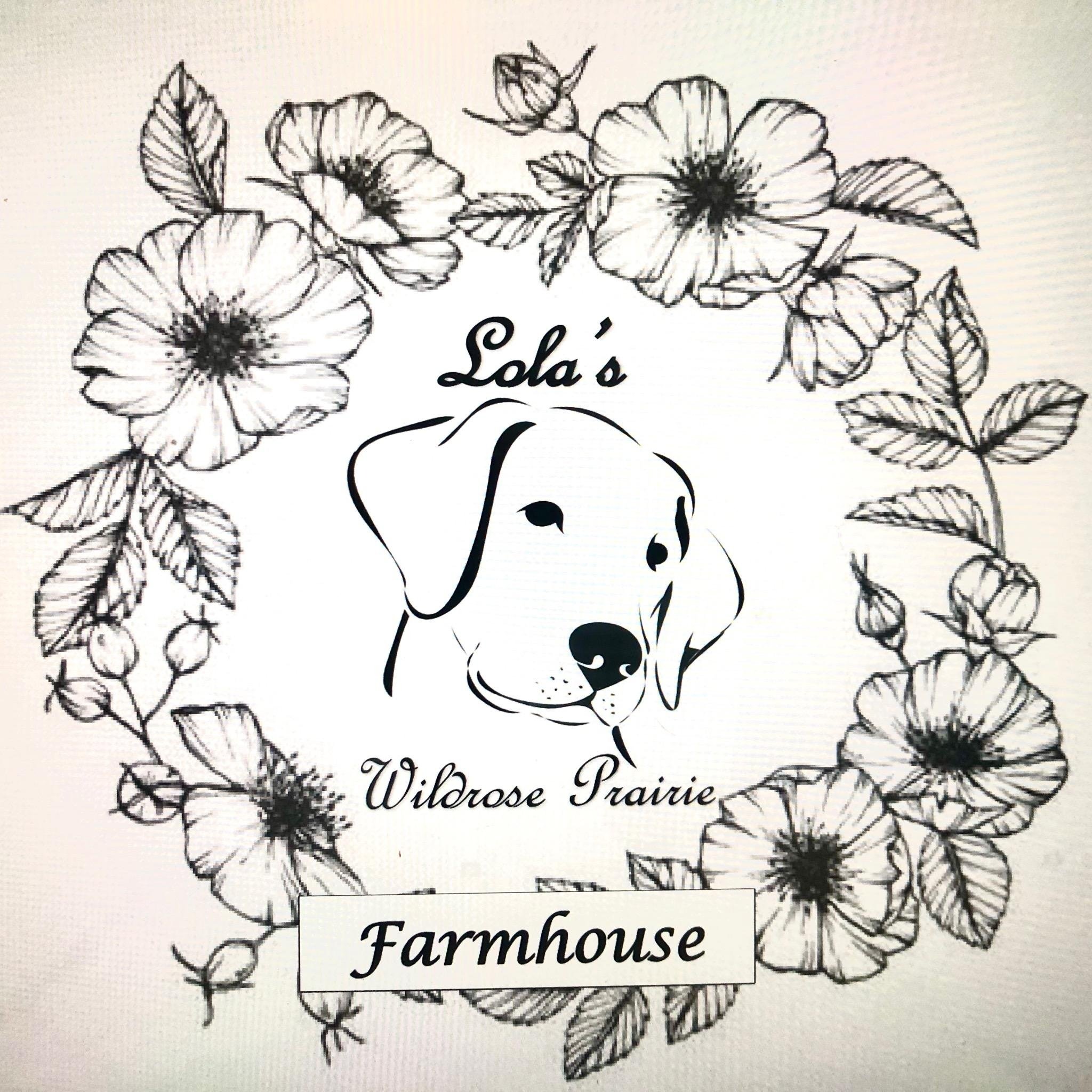
Graphic Design: Lola’s Wildrose Prairie Logo
Role and Impact
Engaged as a designer for Lola’s Wildrose Prairie, a thriving farm in the Pacific Northwest owned by my friends James and Dean, I was tasked with designing a logo that encapsulates the essence of the farm. I aimed to break away from the prevailing trend of minimalist and sleek designs by creating a logo that tells the unique story of the farm while maintaining a modern, sophisticated aesthetic.
Deliverables
Logo Design: I used watercolor effects to create a warm, nostalgic, contemporary logo representing Lola’s Wildrose Prairie’s diverse ecology and rich history.
Symbolic Imagery: The logo features a wreath of wildflowers, a homage to the harmony between the farm and its surroundings. The wreath was inspired by a housewarming gift I gave to James and Dean - a sachet of wildflower seeds - and symbolizes growth and beauty in unexpected places.
Bee Illustrations: The logo also includes two bees, which signify one of the farm’s initial products - local honey. The bees reflect the farm’s commitment to working harmoniously with nature and the critical role of these pollinators in maintaining the ecosystem.
Reflection: “Designing the logo for Lola’s Wildrose Prairie was a rewarding journey that allowed me to tell a vivid, meaningful story through visuals. The final product balances aesthetics with depth, embodying the farm’s vibrant life, diverse produce, and close-knit relationships among its human and animal inhabitants. The design process demonstrated the potential for logos to be visually appealing and imbued with rich narratives, proving to be a refreshing departure from the more sterile minimalism often seen today.”


